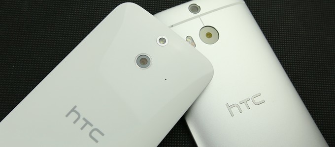
HTC M8 in the market, it was a huge success, almost all those who come into contact with the metal flagship handset will marvel at its design and smooth. After the M8, HTC hopes to launch again M8 "plastic"--HTC One fashion, this phone is basically extended configuration of the M8 and the fuselage design, but replaced the back cover material with plastic, and became a single replacement after a 13 million-pixel camera.
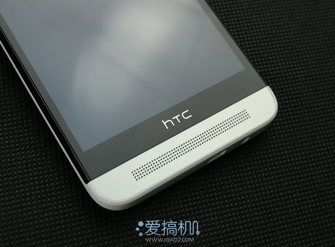
HTC One stylish version of the overall visual design continues the design of the M8 style, front-BoomSound dual speaker
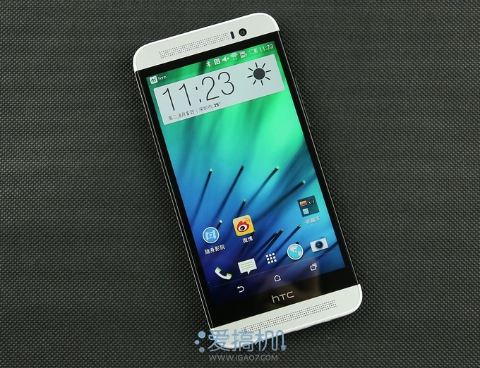
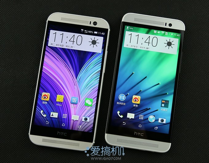
Positive and very similar to the M8, M8 rounded corners more than One fashion
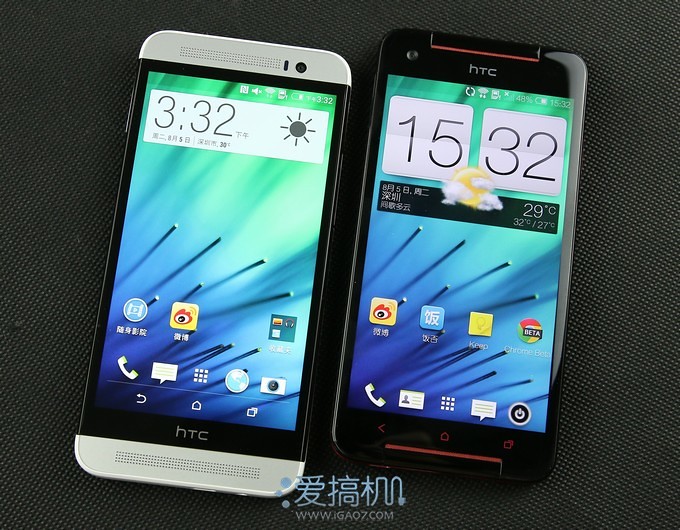
One stylish version comparison and Butterfly s, which body is more compact, relatively short fuselage length
Front-facing camera to reach 5 million pixels, back-illuminated sensor, and M8 size is the same
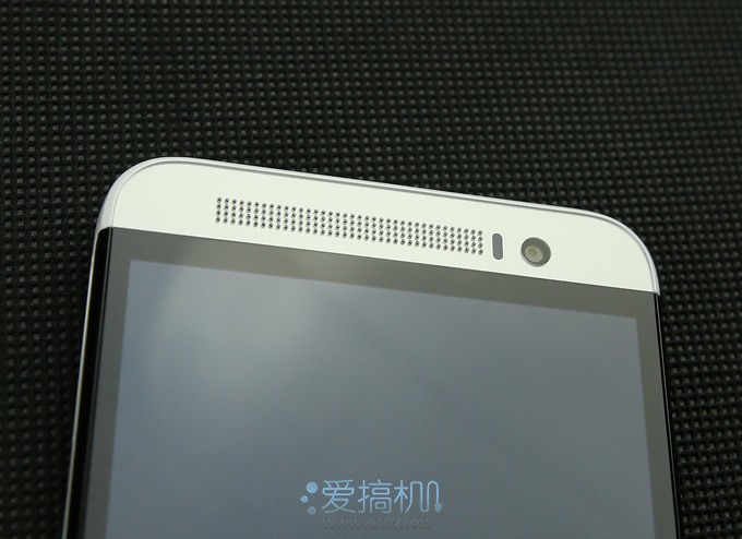
"JAWS" section, and M8 uses the virtual keypad design
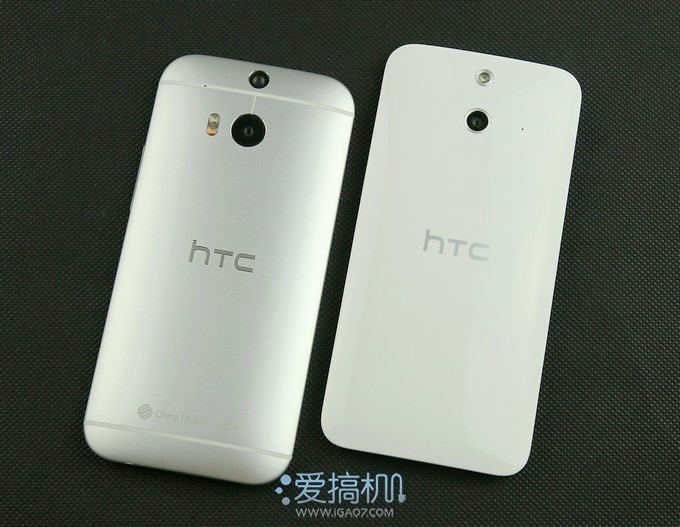
Back cover is a piece of white plastic, which is biggest difference between the M8 and metal back cover
One fashion, and Butterfly s comparison of the back cover, both using a camera and an LED light lamp
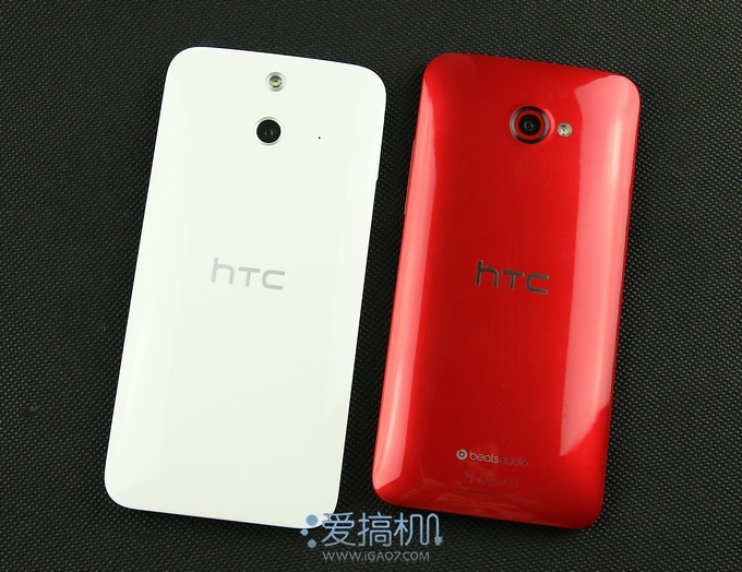
One stylish Edition uses a 13 million-megapixel back-illuminated camera sensor from OV, and a fill light, such a configuration is M8 dual camera + dual-color for fill light, much simpler
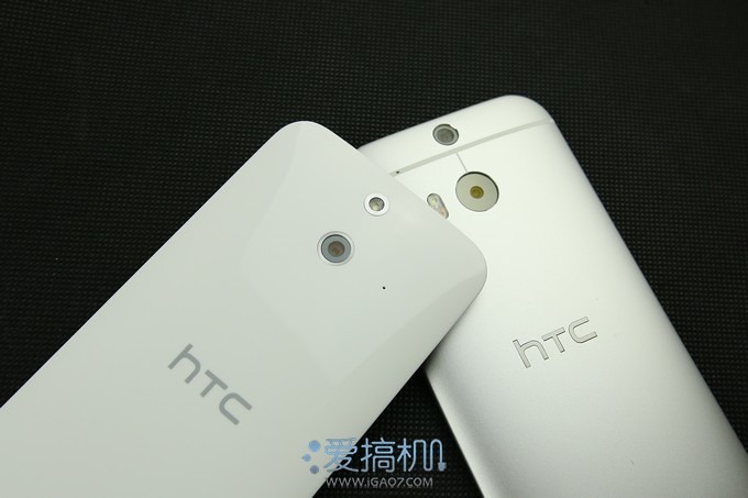
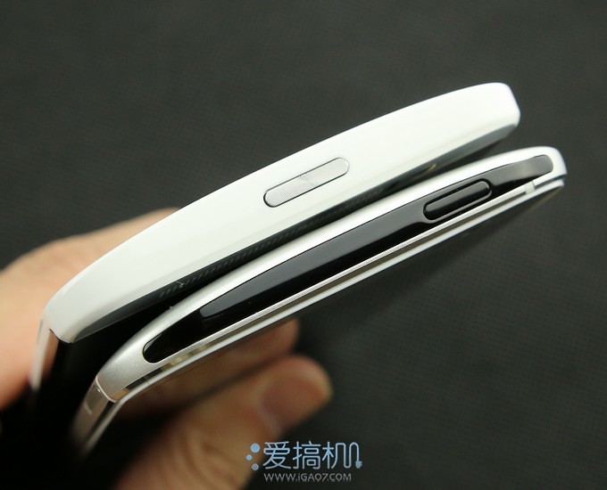
M8 top black block is actually infrared sensor modeling and contains black power button on the right side, and One fashion only in the top-mounted power button, power button using the surface of concentric circles with silver thread. Power key on top of the fuselage for the two 5-inch screen phone, is not very convenient in use
Both designs at the bottom were the same, are 3.5mm headset interface and micro-USB interface
Is the micro-SD card slot on the right side of the fuselage, and volume keys
Cato is metal in One stylish version of micro-SD
Is a SIM card slot on the left side, One stylish Edition continues the design of the M8, using the Nano-sim card, which is not very convenient for many users
Cato SIM card is plastic, this asymmetry on both sides a little puzzled
5-inch screen, with curved back and lighter fuselage, making One stylish version of feels nice to hold, of course, in tactile and M8, I still have a big gap
Now that is a continuation of the design of the M8, One fashion can not escape "around the Israeli-Palestinian"
One stylish version SLCD3 screen, but the brightness is much higher than M8 and other mobile phone, we measured data is 524cd/square meters, quite powerful
While the M8 was "only" 480cd/square meters, this is already a good data
More about One fashion experience, in our video testing to be introduced in the near future to introduce.
3780 votes
Millet 4I
Variants as a downgrading for the midrange model, millet 4 hardware configuration I was still a very cost-effective mobile phones. Red rice at similar price points and charming blue although the price is a little lower, but configuration does not meet the standards millet 4 I, profile millet 4 I close to the people, at a slightly higher price in Exchange for better performance and appearance, so why not?
View details of the voting >>
3 people collection
Share: more

No comments:
Post a Comment